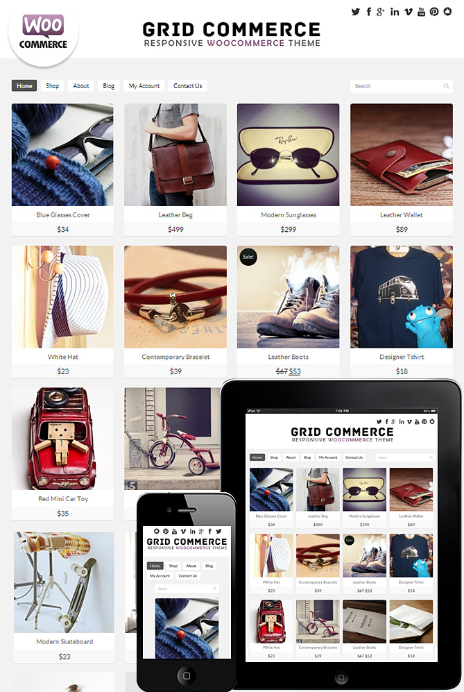
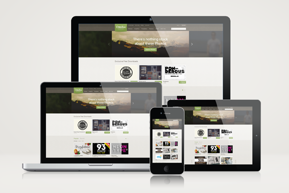
At Phuket Web Media our websites are design to be fully responsive across all devices so that they can look great no mater what device you are using. This means that all the sliders, menus, logos, videos and images will resize them selves to the devices you are on, which means no zooming in and out or across to view content.
Not so long ago small-business websites were created with viewing on a full-size computer as the only option. Now, with the majority of potential customers accessing the internet on mobile devices, one-size-fits-all web design is dead!
If you want your website to actually generate income and rank well on search engines, then you absolutely need a fully responsive design that can be viewed on mobiles and tablets.
Responsive web design Phuket means your site will automatically reconfigure itself, or “respond,” to suit the size and type of device being used. It’s mostly about enhancing the user experience, but also remember – since April 2015, search engine giant, Google, will start penalising sites that do not conform to mobile friendly web standards. Pages need to load quickly, and not lose any functionality. Web forms should work, photo galleries need to work, payment methods, etc etc.
What do you need to think about when developing content for your mobile-friendly website?
Statistics now show that the majority of web users are finding products and services on their mobile phones. 3g and 4G networks are everywhere and here in Thailand the whole world is connected via their phone. Make sure your site looks great and works properly on a mobile then scale up to tablets.
What products or services are they looking for on your site? Display a prominent search box or list of services near the top of the page. Don’t make people search to hard for what they need from you. Make it obvious.
To find your location? Be sure to have a responsive map and of course contact form that works on mobile.
To make an appointment or reservation? Again – display your contact details clearly at the top of the site. a phone number that is clickable and of course a contact email address. Add a quick link to newsletter sign up or email subscription too.
Make it easy to call you? Remember – these are phones, after all. Yes, you can still include attractive images and colors on the smallest version of your site design–as long as they load quickly, appear legible on a small screen, and most important, don’t interfere with users taking action.
Once you’re happy with how your site looks and functions on a mobile start thinking how is works on a tablet.
A fully responsive site built by Phuket Web Media will perfectly re-size to look great on a tablet. Remember that images and video content look great on the new tablets with the super high resolution being offered by iPads and Samsung tablets. Video content — just make sure it uses HTML5 because Adobe Flash video doesn’t work on many mobile operating systems.
There are still a few old fashioned people out there accessing the internet on their desktop and mobile and of course you want your site to look great on a 27″ monitor. But lets not forget that these guys are making up a small percentage of your potential customers. Make it look great but never lose sight of the fact that your website is supposed to generate income!
It’s one thing to try and guess how viewers will use your site, but actually quite another to see what they do once they are there. Be sure to use web traffic analytics tools like Google Analytics on your site. Pay very close attention to how mobile traffic differs from regular computer traffic, and then adapt what content you include and where according to these statistics. If you see that many mobile visitors are using your search box to find a certain kind of product or service, make sure they are finding it in the easiest way possible on a mobile. Place a great big button in the header if you need to.
Over time, you’ll see the mobile portion of your web traffic grow. Stay focused on this and adjust your homepage to make it a user friendly experience for mobile users.
There are many more ways you can fine-tune your responsive website design and content. Get in touch with Phuket Web Media today for no obligation advice about responsive web design. Rethink the way you do business on the internet and join the Responsive Web Development Party!
For more about quality content and smart design………
Read this great article by Cynthia Boris – a contributor at entrepreneur.com
We use cookies to improve performance, and create a better experience when using our website You can learn more about our cookie policy at Privacy Policy and can manage your own privacy settings here: Settings